
About Map
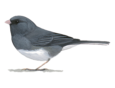
JUNCO vs TANAGER: Journey Through Urban America
Watch how two bird species, the Dark-eyed Junco and the Summer Tanager, migrate throughout the United States as seen by 29 of its cities. The birds aren't the only ones who get to journey throughout America though; explore the map city-by-city to see America's most popular urban bird hotspots!
Cartographer: Cory Leigh Rahman
Symbology
Each circle on the map represents a US city. The color of the circle refers to one of two bird species; blue for the Dark-eyed Junco (a winter migrant) and red for the Summer Tanager (a summer migrant). The size of the circle represents the proportion of birds seen in one month compared to the whole year; e.g. if you see 50%, that means 50% of all bird sightings in the year were seen in just that one month.
Once zoomed in to a city, each purple circle represents a popular birding hotspot; the darker the purple, the more popular the hotspot. These urban hotspots are often pockets of nature and greenery in the otherwise impervious, concrete-filled cities.
Methodology
All bird and hotspot data are from the Cornell Lab of Ornithology's eBird. This is a citizen science platform where birders worldwide can submit bird survey checklists. Data was downloaded in 10 batches: 5 years (2012-2016) for each of two bird species, the Dark-eyed Junco and Summer Tanager. The data came in hundreds of thousands of data points, one for each species in each survey submitted to eBird. These points were merged together, filtered to chosen US cities, then aggregated and reorganized into species counts per month for each of the chosen cities. A total sightings count for each city was also kept in order to calculate the percentages used in the map symbology.
Technology
This map was built using the Leaflet JavaScript Library, jQuery and some Bootstrap. The data were processed using both ESRI ArcGIS and QGIS. The code was developed in Brackets and version-controlled using Git.